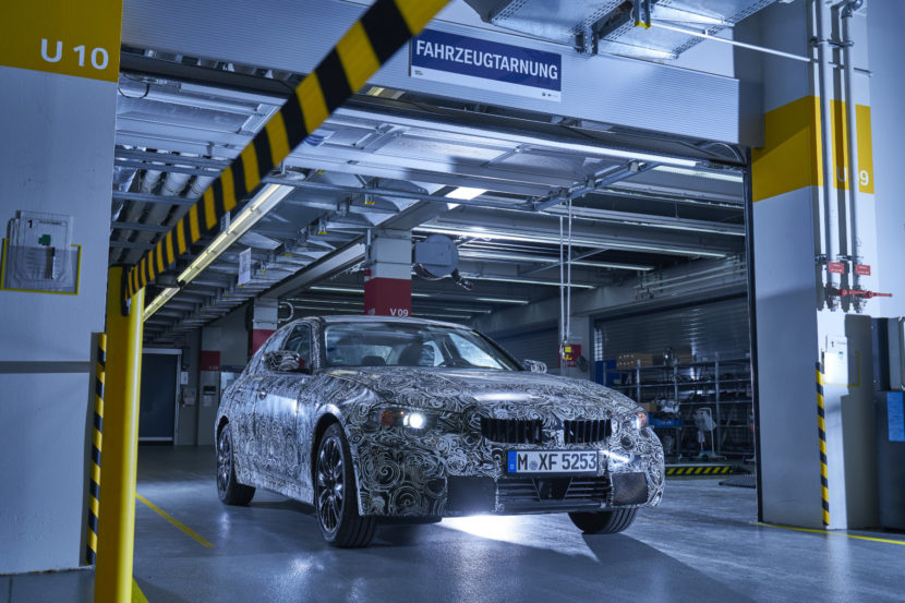
BMW is going through a big change in terms of interior design. Its current interior design language is on its way out and a new one is making its way through the lineup. The BMW 8 Series is leading the charge, with the Z4 Roadster following suit. But the biggest, most important BMW to sport this new interior is the G20 3 Series. Some new spy photos have just surfaced and they show off almost the entire interior, or at least all of the features that matter. (We don’t own the spy photos but they can be seen here)
The BMW 3 Series is arguably the most important car for BMW. It’s the brand’s best seller, it’s most iconic model and the car that catapulted the brand into the “Ultimate Driving Machine”. So its new interior is very important, especially in this modern age where technology, style and comfort are priority over everything else.
In these new photos, we get to see the gauge cluster, center stack and center console, all of which have been updated. To start, though, this test mule seems to have the current semi-digital gauge cluster. Either this is an older test mule that hasn’t been updated to the new digital instrument panel yet or the latter is going to be an optional extra that this test mule lacks. However, we’re hoping this is just an older tester because BMW’s new digital gauges are far better looking than the current ones seen here.
After that, we get a good look at the center stack of buttons and the new HVAC controls. We’re curious to see how these HVAC controls work out because the screen for them, nestled in between two large air vents, seems a bit small. However, we’re happy to see that the controls have been simplified a bit, as they can be a bit confusing on current cars and the buttons seem just a bit cluttered.
As for the new shift lever and all of the buttons that surround it, this is probably the biggest change from the current 3er. The new shift lever the same one you’ll find on the new BMW M5, upcoming 8 Series and new Z4. While it’s a bit funky looking, it’s better looking than the aging and oddly shaped one on current BMWs. However, it’s the buttons that surround it that are more important. The new rotary iDrive dial now features a knurled aluminum rim, which will both look and feel far more premium than the current plastic one. It still has the same redundant buttons surrounding it but it adds a new one, which looks like some sort of internet button.
The starter button now moves next to the shifter and is aluminum, rather than the black plastic current ones. Above that button are the typical parking sensor and traction control buttons, as well as the button to turn off Auto Start/Stop. Below the new starter button are the drive select buttons and there’s the interesting addition of BMW’s Adaptive mode, which is currently only on higher end models.
This new BMW 3 Series also gets an electronic parking brake, which is a first for the model and will disappoint a lot of fans. The current F30-gen 3 Series is the last car in its segment to sport a traditional, mechanical hand brake and it’s something fans appreciate. So losing it will disappoint some.
Overall, this looks like a big upgrade over the current 3 Series, which has an aging interior that is no longer competitive in the segment. It will be exciting to see the new 3 Series without any of its camouflage.
[Source: Car Scoops]The article SPIED: G20 BMW 3 Series Interior almost fully revealed appeared first on BMW BLOG
from BMW BLOG https://ift.tt/2HMv05p


No comments:
Post a Comment