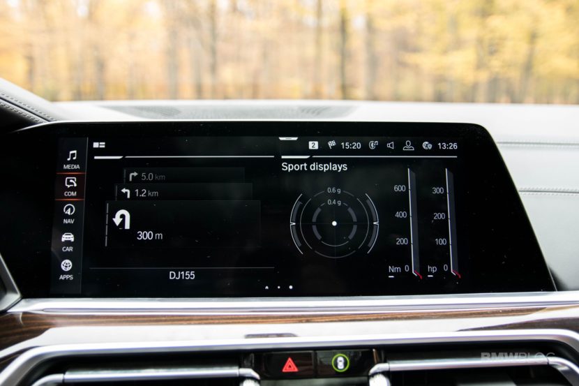
The introduction of the new iDrive 7.0 infotainment system on the new X5, 3 Series, 8 Series and Z4 models is one of the most important moves BMW made in the last few years. That’s because this system basically dictates how you interact with your car and, even more than that, is the first one to include BMW’s Intelligent Personal Assistant, a feature that will become more and more prevalent in the future.
BMW is investing heavily into its AI personal assistant and without iDrive 7.0, that wouldn’t be possible. But leaving that aside for a moment, let’s take a look at what the new system looks like and how it works because the changes are a bit deeper than one would expect. At a first glance, you’re met with a completely new screen that’s been heavily reorganized and it’s going to take a while to get used to it. Instead of the usual six sub-menus we’d get before we now have five, on the left side of the screen.
What you’re actually looking at are pages, kind-of like the pages of a smartphone where you’ll find widgets with what you need. You can configure these pages to show the information that’s most relevant to you in various sizes. A page can contain two, three or four different widgets, in varying sizes. They also work as shortcuts to different submenus, once you tap on them or use the iDrive controller to. The video below also shows you can can change their size and what you can actually pin to your screen.
What makes this new layout interesting is that you can set up your pages (up to ten of them) on different themes. For example, you can set one up for your navigation screen, including a map, traffic info and compass. You can also set a different one up with interesting car info, from fuel consumption to g-forces and horsepower and torque readouts.
The possibilities are quite baffling.
Here is also our own demo of the iDrive 7.0
The article Video: Here’s How to Customize the New iDrive 7.0 Screen appeared first on BMW BLOG
from BMW BLOG https://ift.tt/2QjvEvz

No comments:
Post a Comment